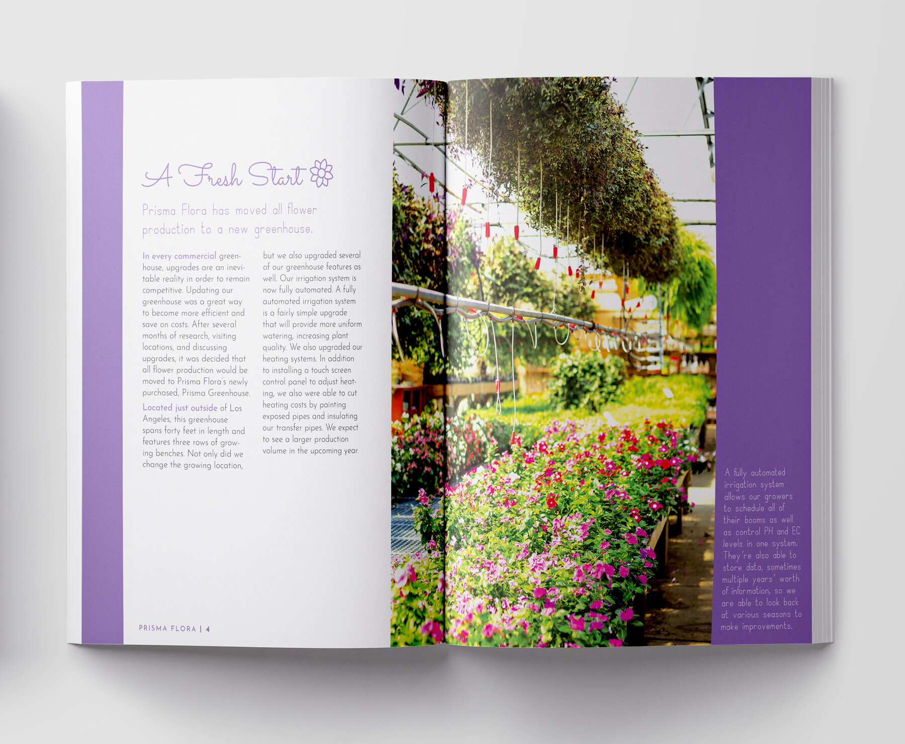

Clean, fresh, and fun, Prisma Flora’s branding was designed to be as upbeat and trendy as the company itself. Prisma Flora is a floral shop where customers can assemble their own bouquets. Each element of the brand identity was designed to be crisp and modern with a dash of vibrant color. While floral shop branding typically leans towards scripts and handwritten font choices, Prisma Flora dares to be bold with delicate sans-serifs in the logo. The graphic pattern that is found dancing around the branding adds to the festive nature of the company. Each page of the capabilities brochure utilizes vibrant photos and icons to help illustrate the content. Prisma Flora is not your average flower shop!